
Contact me
Oops! Something went wrong while submitting the form.
Contact Me
Photos are one of the most important aspects of a property listing. New properties that go live with more photos have a higher likelihood of getting their first booking quickly.
The Partner Central Onboarding Photos step is overly complex, built on legacy tech, and is missing fundamental features. As a result, it’s one of the most difficult steps for partners to complete, many properties only upload the minimum photos, and legacy tech holds us back from innovating with in-context coaching and simplified workflows.
If we simplify the PCO photos step with automated photo labeling, more guidance, and feedback about rejected photos, then partners will upload more photos, complete onboarding faster, and get their first booking more quickly.

Reviewing Quantum Metric recordings on the current page revealed significant user frustration. We observed partners rage clicking and searching for tags that do not exist in our system. As a result of these tedious steps, partners appeared to be uploading far fewer photos than desired.

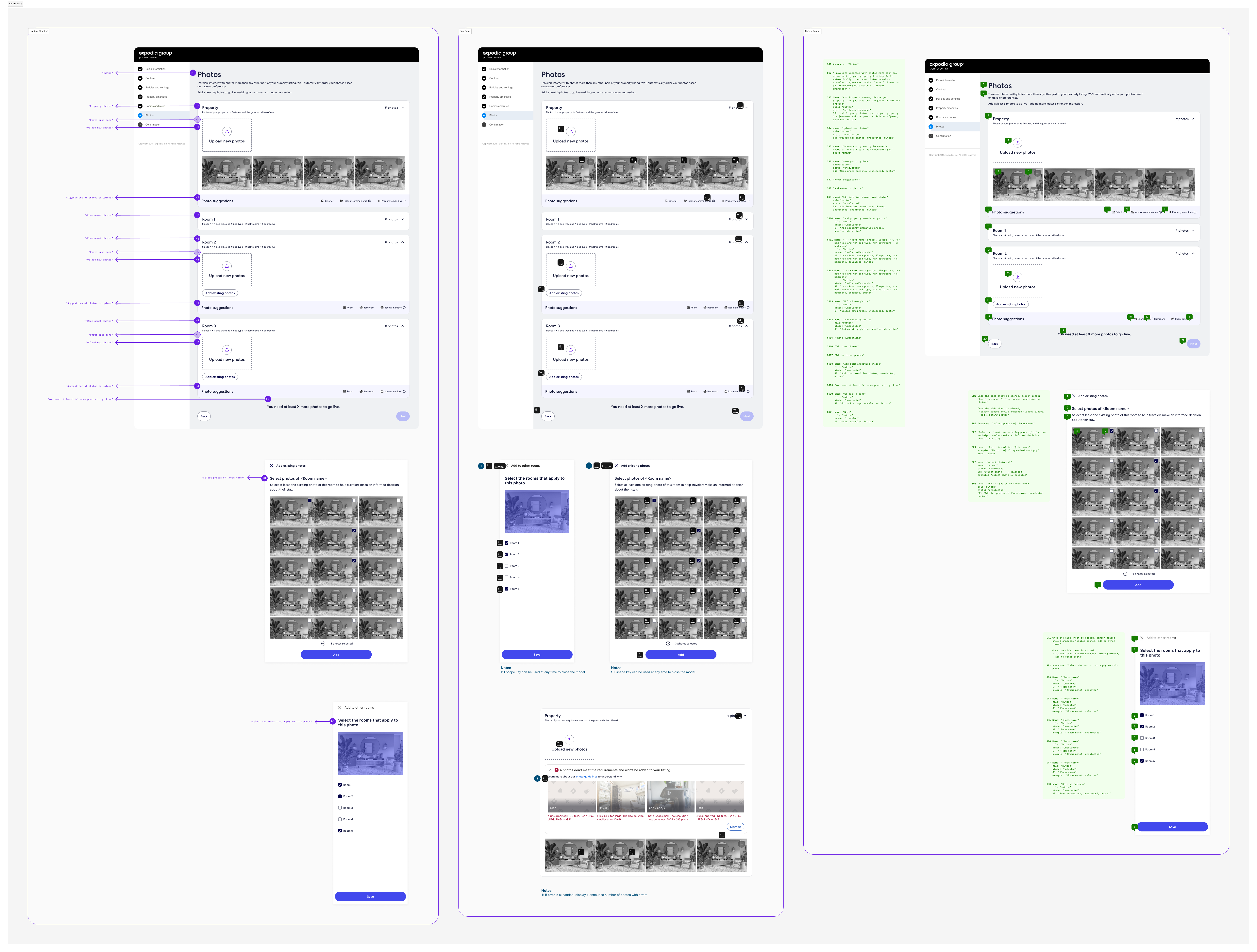
Stripping the experience to the primary information architecture, allowed us to layer on elements without losing sight of how partners organize their images and ultimately build out their photos page. Understanding that this step immediately follows the room creation step, allows us to bridge the two experiences, pull in the room names recently created and playback their features to ensure a cohesive experience. We wanted to reduce friction as much as possible and new usage of auto-tagging drastically improved the flow of the page.

Our initial design proposal bucketed photos by rooms and had a simple uploader with options to either upload new or existing photos. Unfortunately, due to the large development effort migrating away form our legacy tech stack, we did face constraints for our MVP. Our recommendations must remain static as opposed to dynamically pulling in suggestions based on selections made during onboarding. Additionally, our current technology prevents us from integrating the photo uploader in-line with other page elements, resulting in a poorly balanced overall design.
Launched
As part of the MVP rollout, we will be conducting a 50/50 A/B test against the current experience. Key metrics tracked included conversion rate, number of photos uploaded, percentage of bookings within the first 14 days, and time spent on the photos step.
As of September 2025, we are actively conducting UAT testing prior to launch. We are optimistic that our page improvements will deliver a much simpler and more enjoyable experience for our users. We have yet to begin work on adjusting the in-line drag-and-drop uploader, but in the meantime, we are finding additional locations within the maintenance page to scale this design across Partner Central and Vrbo.